The platform will be the beating heart of the communication activity. A well-defined coordinated image will accompany both paper and digital materials, starting from the logo.
More generally, the actions planned, planned and implemented throughout the project duration will be described through a integrated communication campaign.
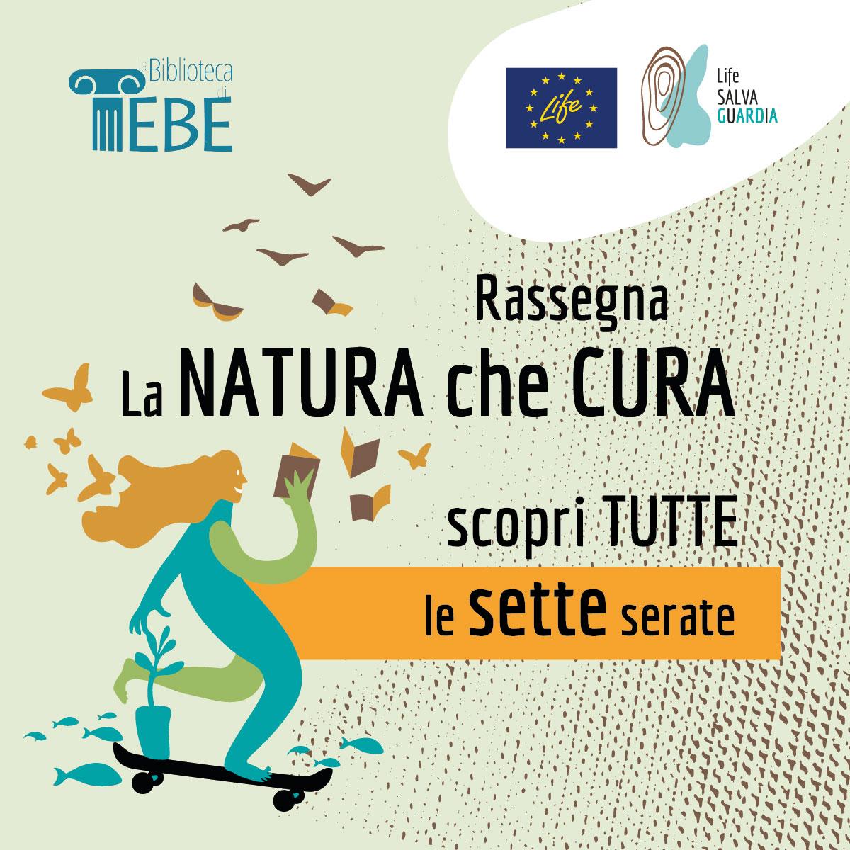
The Life Safeguard logo - chosen by the Committee from three different proposals - comes from the intertwining of different inspirational elements: the geographical form of Lake Garda, theFingerprint and the isoipse. The fingerprint, an immutable sign that distinguishes the individual, merges with the isoipse, which represent the land in all its parts; all this to symbolize the inevitable correlation between the mark that each individual leaves on the environment that surrounds him.
The Safeguard brand. For all those who share the principles of the project and who participate in the initiatives as supporters or as direct users, the BRAND that demonstrates and certifies the real involvement and commitment in the actions is recognized. The brand graphically recalls the LIFE SALVAGuARDiA logo, and is divided into three levels characterized by different colors and greater isometric lines inside.
All the communication tools envisaged unite three interconnected and interdependent areas for the pursuit of project objectives: the area of training andeducation; the area of the communication and knowledge; the area of the participation and sharing.


